SoteriaMe is a mobile companion app to Infocare’s desktop product, Soteria. It helps patients stay on track between visits with reminders, symptom logging, and messaging, while reducing admin load for clinicians. My role was to design the end-to-end mobile experience, balancing patient usability with clinical accuracy.

The Challenge
Patients struggled to stay engaged between visits, while clinicians were weighed down by repetitive admin and fragmented tools. This reduced treatment adherence and overall quality of care.
Core Challenges
For Patients
- Forget appointments due to unreliable or confusing reminders.
- Struggle to access or manage health information between visits.
- Feel disconnected from care without clear communication channels.
For Clinicians
- Lose time to repetitive administrative tasks (e.g., sending reminders).
- Have limited visibility into patient engagement outside the clinic.
- Need tools that support, rather than complicate, their workflow.
For the Business
- Improve patient engagement and reduce missed appointments.
- Free up clinician time by reducing manual admin.
- Demonstrate Infocare's ability to innovate beyond desktop systems.
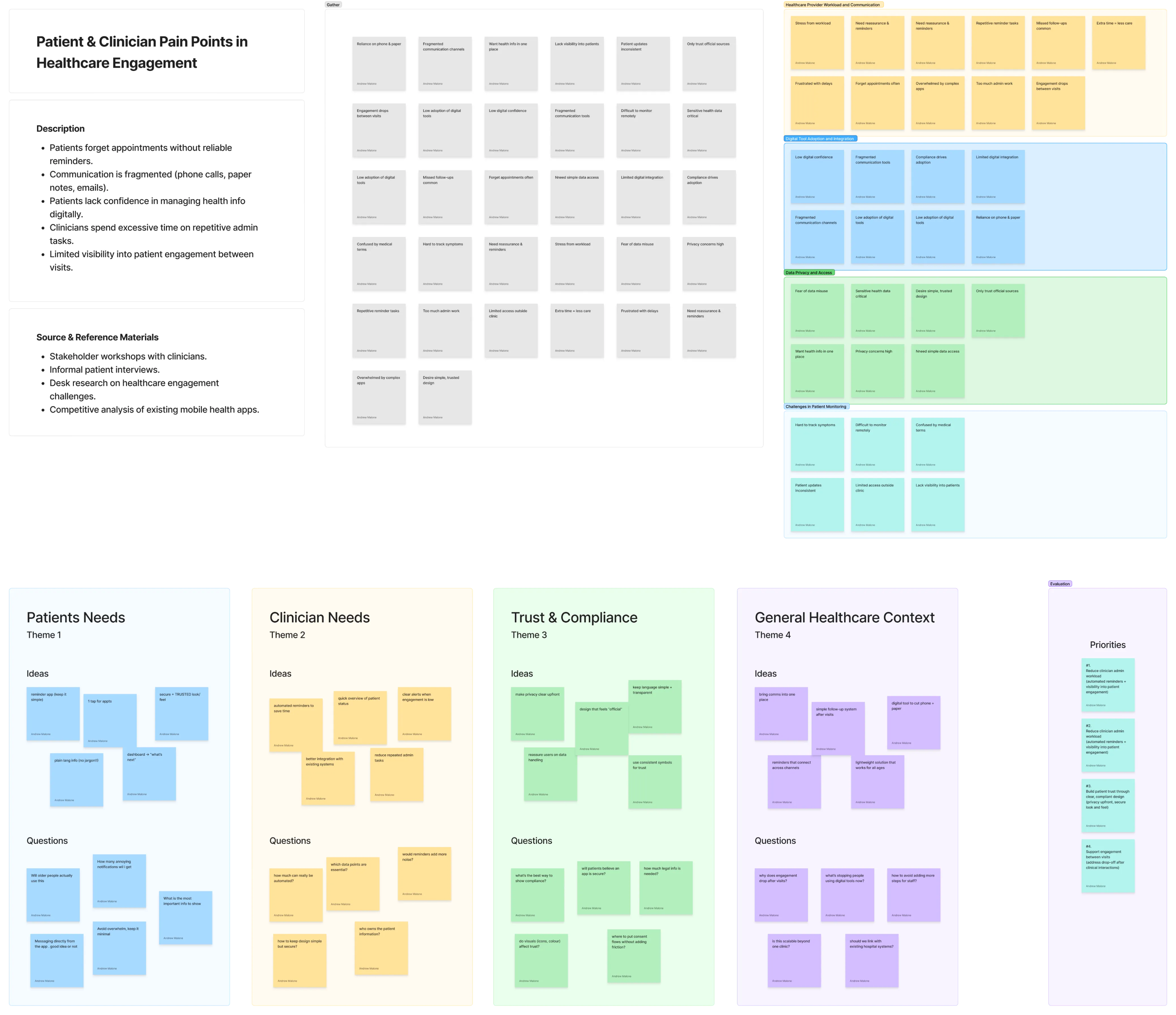
Research & Discovery
We combined clinician workshops, desk research, competitive analysis, and light patient interviews to understand the challenges around care between visits.
Key Insights
- Patients often forgot appointments and instructions once they left the clinic, and many lacked confidence using digital tools without guidance.
- Clinicians spent significant time on repetitive reminders and had limited visibility into patient progress between visits.
- Trust and compliance were critical to adoption. Patients needed reassurance that their data was safe, and clinicians required confidence in regulatory alignment.
Constraints
Due to privacy regulations, formal patient research was limited. We used small-scale patient interviews and clinician input as proxy validation, which provided directional insights to guide early design.
Personas & Journey Mapping
- Created detailed personas for patients and clinicians
- Mapped end-to-end user journeys
- Identified key touchpoints and pain points

Mary O'Connor, 46
Patient managing a chronic condition
Background
Attends regular clinic visits, owns a smartphone but has low digital confidence. Relies heavily on written notes and phone calls.
Goals
Stay on top of appointments and medication, feel supported between visits, access information in plain language.
Pain Points
Often forgets instructions once she leaves the clinic, feels overwhelmed by too much information at once, finds existing apps too complex.
Design Needs
Clear reminders, step-by-step guidance, and a simple way to log and share symptoms.

Dr. Javier Morales, 38
Clinician in a busy urban hospital
Background
Tech-savvy but time-poor. Manages dozens of patients daily and wants tools that integrate smoothly into existing workflows.
Goals
Spend less time on repetitive admin, quickly see which patients are engaged, and focus on meaningful care.
Pain Points
Too much manual admin, limited visibility into patient progress, and fragmented communication tools that create extra work.
Design Needs
Automated reminders, at-a-glance engagement data, and a secure, lightweight messaging channel.
Design Process
Ideation
We ran workshops with clinical stakeholders to generate concepts, framing "How might we..." questions such as "How might we make patients feel supported between visits without adding extra work for clinicians?"
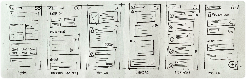
Exploration
We developed low-fidelity wireframes to test navigation and flows, iterating quickly with feedback from clinicians. Early prototypes focused on reminders, dashboards, and secure messaging.
Collaboration
Design decisions were shaped in close collaboration with clinicians, the product manager, and engineers. This ensured solutions were both medically accurate and technically feasible.
Iterations driven by feedback
- Early dashboards felt cluttered → simplified to highlight the next appointment and urgent tasks.
- Navigation required too many taps → reduced to one-tap access for critical flows.
- Clinicians requested visibility into patient activity → added engagement indicators.
These changes shifted the dashboard from static information toward an actionable daily guide.
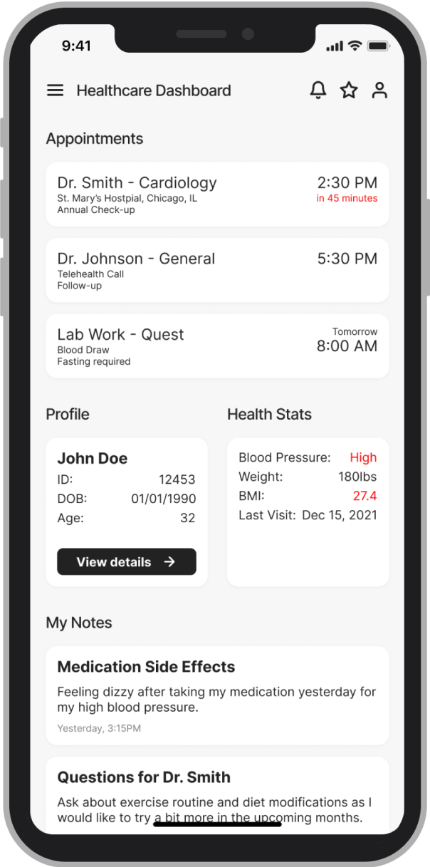
Final Solution
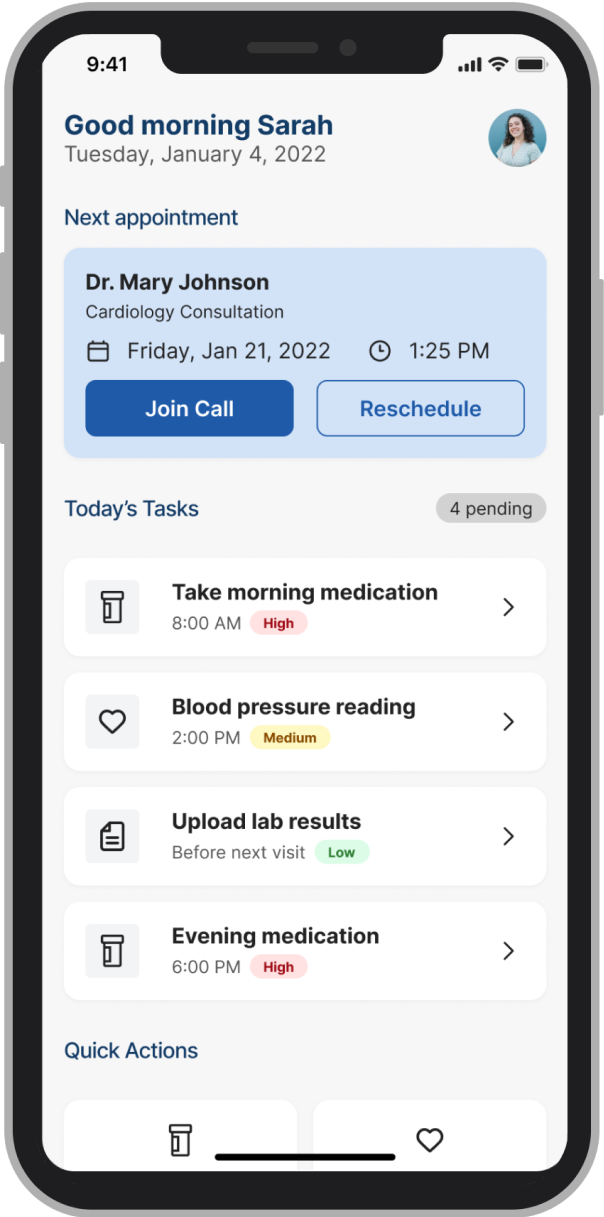
Dashboard
We designed a clear, patient-friendly dashboard that surfaces the most important information first. The next appointment appears at the top, followed by urgent tasks such as medication or symptom logging. This simplified view helped reduce confusion and ensured patients always knew their immediate next step.
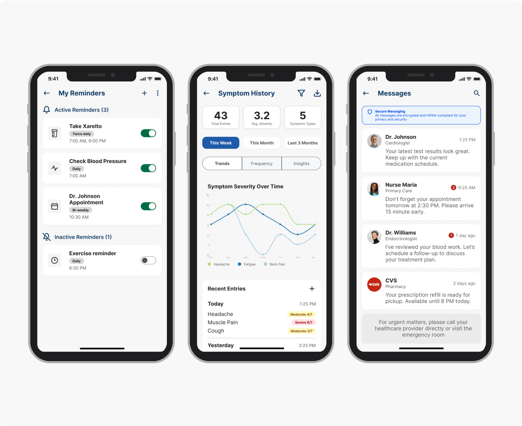
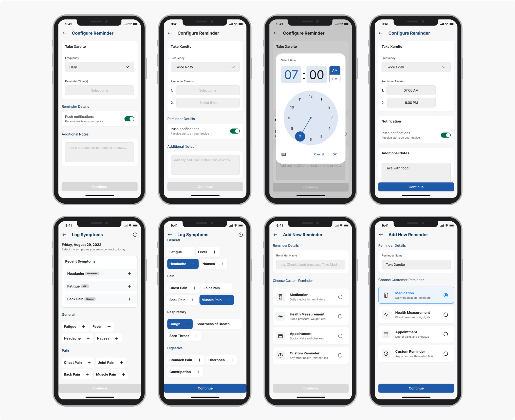
Reminders
Patients could set up reminders for medication, appointments, and daily care tasks. Push notifications were integrated to ensure important actions weren't missed. The flow was kept lightweight, with minimal input required, to support users with lower digital confidence.
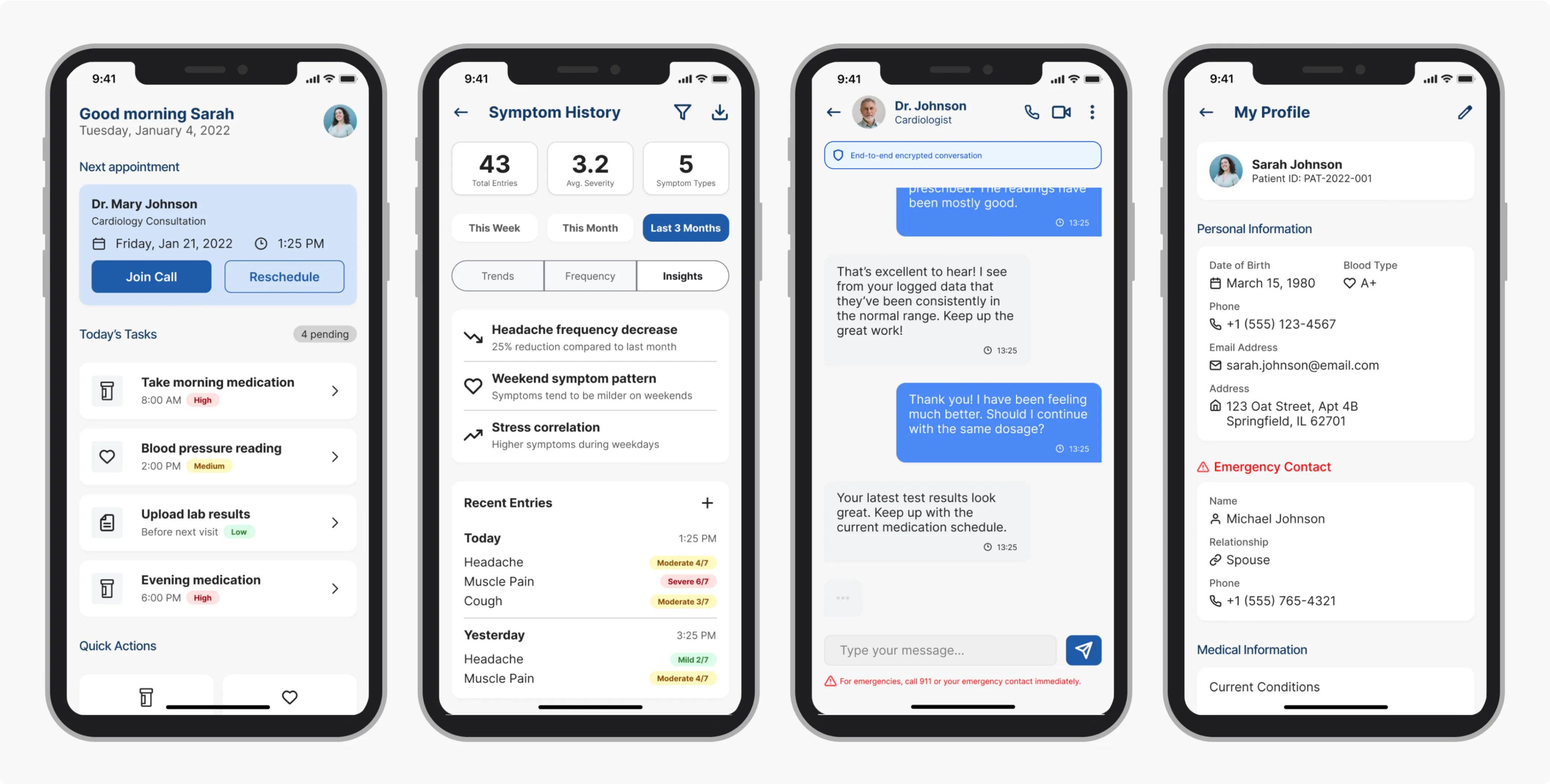
Messaging
A secure messaging channel allowed clinicians to send instructions and updates directly to patients. This feature gave patients a sense of reassurance while reducing the need for repeated phone calls or manual follow-ups from clinicians.
Symptom logging
Patients were able to log symptoms and daily health data through simple forms and sliders. This information was presented back as a timeline or trend view, giving clinicians visibility into patient progress between visits.
Design system and accessibility
The UI was built on reusable Figma components to ensure consistency and scalability. We used accessible typography, clinical blue tones from Infocare's brand, and WCAG-compliant colour contrast. Tap targets and text sizes were designed with inclusivity in mind, making the app usable across a wide patient demographic.
Outcome & Impact
The Patients
Patients could access their next appointment in just two taps, reducing confusion and helping to prevent missed visits. Clear reminders and task lists gave them a stronger sense of support between clinic visits, while having instructions and health history in one place increased confidence in managing their care.
Clinicians
Automating appointment, medication, and task reminders reduced the need for manual follow-ups. Feedback suggested this could save up to two hours per week, freeing more time for meaningful patient interactions. Engagement indicators provided early visibility into patient progress, allowing clinicians to intervene sooner when needed.
"It's easier to remember what the doctor said when it's all written down here." - Patient test user
"I can see when patients are actually engaging, not just waiting until the next visit." - Clinician test user
The Patients
Patients could access their next appointment in just two taps, reducing confusion and helping to prevent missed visits. Clear reminders and task lists gave them a stronger sense of support between clinic visits, while having instructions and health history in one place increased confidence in managing their care.
"It's easier to remember what the doctor said when it's all written down here." - Patient test user
Clinicians
Automating appointment, medication, and task reminders reduced the need for manual follow-ups. Feedback suggested this could save up to two hours per week, freeing more time for meaningful patient interactions. Engagement indicators provided early visibility into patient progress, allowing clinicians to intervene sooner when needed.
"I can see when patients are actually engaging, not just waiting until the next visit." - Clinician test user
Reflection
Balancing the needs of patients seeking simplicity and clinicians requiring precision was the biggest challenge. With more time, we would have tested with a broader mix of patient profiles to strengthen inclusivity.
This project reinforced the importance of empathy, compliance, and clinician collaboration, and it showed how thoughtful design can both improve patient experience and position Infocare as an innovator in digital care.